Identities

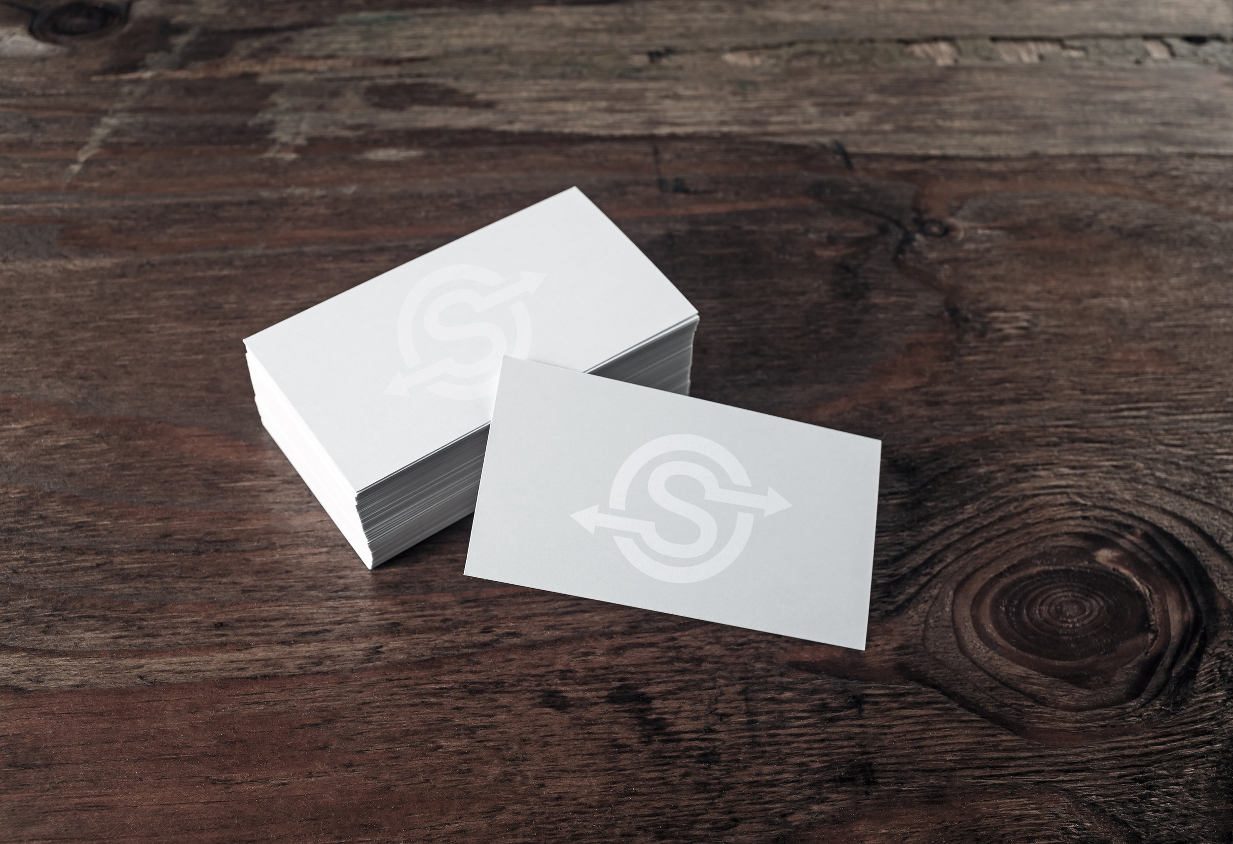
Secret Service Identity
Contributors
Graphic Designer: Haley Wesley
Challenge
I was challenged to put design to a project with a strong mission. There was a need to create an identity for an interesting way to do mission trips.
Secret Service is a mission trip starkly different from others you may know. You start your trip not knowing where you are going or what you will do.
Secret Service really isn’t a new idea but a practice of how Jesus walked with his disciples, going slow enough to notice their surroundings and stopping when others needed help. Secret Service strives to follow Jesus by taking seriously His call to love and help your neighbor. Whenever and wherever you may encounter them. To fully follow, you take away your schedules and timetables, leaving nothing but to pray and follow.
So where do you go and what do you do on a Secret Service trip when a destination is not planned? God knows! Whatever we find to do we’ll do. It’s that simple.
Solution
A big part of this style of mission trip is for it to be secretive. The purpose is not to get publicity or praise for good deeds but just to do good deeds unnoticed. So it was important that the identity be subtle. This mission trip can also take you in any direction, you never know where you might end up, so arrows pointing in different directions was also incorporated.

Dr. Hemmerlin and Dr. Poh, D.D.S. Identity
Contributors
Graphic Designer: Haley Wesley
Challenge
A Napa Valley dentist needed an upscale logo for their practice. They offer high quality service and a comfortable atmosphere to families needing dental care and prevention.
Solution
The identity uses decorative lettering to make it feel more upscale. The color palette is fresh and clean to match the atmosphere of the dental offices.

ArchieBold Fitness Identity
Contributors
Graphic Designer: Haley Wesley
Challenge
A personal trainer needed a strong bold identity to represent his new business.
Solution
It was important to use fonts that felt lively and active. The use of red makes the identity feel bold and strong.
